Getting Organized for the New Year

I may rarely end -- or even get halfway through! -- the year organized, but I like to start out with my thoughts marshaled, my supplies in their places, and my plans laid out. Here are four ways I'm getting organized in 2014:things-organized-neatly-clipboard 
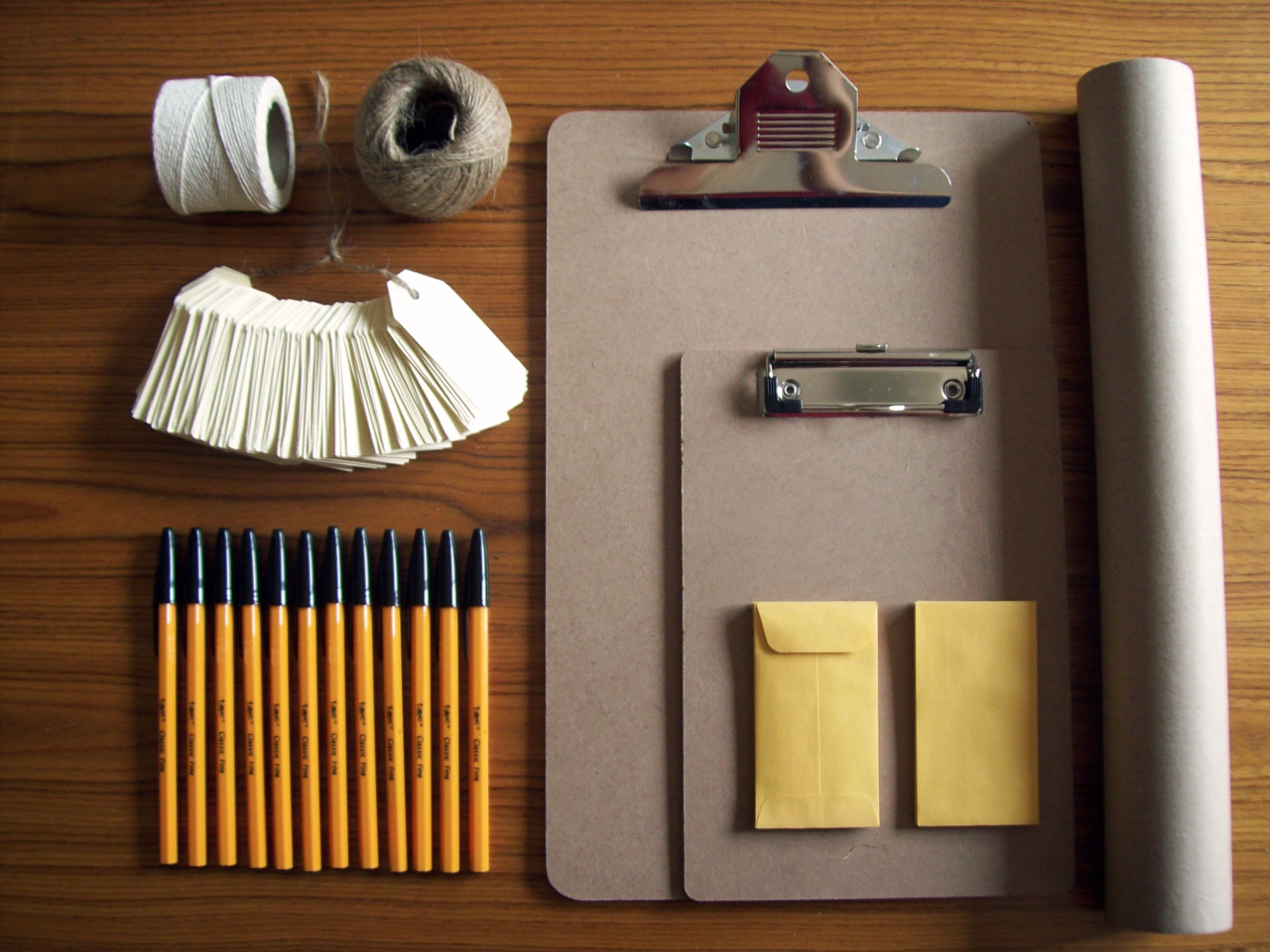
Less Paper. This is tough one, since I work in direct mail, which is a paper-based business. But just because the end product ends up on paper doesn't mean I have to use it day to day. I'm learning to edit effectively on-screen, only opting to print pieces on the last pass. I have developed a pretty sophisticated virtual filing system that includes art, proofs and email communications from clients. I'm even learning to type my notes during a conference call, rather than jotting them into a notebook first -- although I admit that's a work in progress.

Eliminating as much paper as I can is great for the environment, of course. But it's also great for my sanity and my time. No more filing, no more space taken up by bulging folders, and no more paper cuts!

Lists and more lists. I know some people aren't list-makers, but I am. I love to make global lists of things I hope to accomplish this year, as well as the micro lists of daily and weekly tasks. But if you're not into lists, try a spreadsheet or even a Venn diagram -- my husband the former architect enjoys drawing his to-do tasks. The act of jotting down your goals will help you remember them and hold you accountable to achieving them.

calendarTaking Time for Me. I often short-change myself in my rush to complete all my tasks -- and my house isn't even that clean! I'm not sure what's going to be pushed aside this year, but I am determined to take time each day to focus on myself and what I need. I'm confident that it will make me a better consultant, wife, parent, neighbor and friend. Even if it does mean the floor stays dirty.

Be Ready for (Almost) Anything. I often find myself needing to adjust my plans, and when I don't have the right equipment, it slows me down -- and sometimes keeps me from doing things altogether. When the car breaks down, I want to be ready to bike, so I'm getting my winter biking gear stowed together for easy transitions from four wheels to two. When a colleague calls me for lunch, I'm going to be ready to leave the house instead of scrambling to find a clean pair of pants or to brush my hair for the first time that day. And when working at home isn't going so well, I want my laptop bag ready to roll, so I can hit the road without losing too much of my day.

What are you doing to get yourself organized in 2014? Any other tips for me? I could use them!

Three Ways to Make Your Writing More Conversational

I stumbled into the world of nonprofit copywriting by happy accident. I needed a job, any job, and a "Nonprofit Marketing Firm" in my town was hiring a receptionist. My six-month stint answering phones at an answering service gave me a leg up in any receptionist job, so I applied. In the course of the interview with the owner of the company, I mentioned my love of writing. They hired me as a copy editor, and a career was born.

A few weeks later, I had my first solo writing assignment. I was terrified as I handed my boss the piece. She had a reputation for wielding her red pen with wild abandon, and I was so, so green.

She glanced at it long enough to read two-thirds of the first sentence, crossed out the entire page, and said, "Make it more conversational."conversation

Making your copywriting conversational is one of the biggest challenges for every copywriter. We all talk to people every day, so why is writing like we talk so darn challenging?

Here are three sure-fire ways to make your copywriting sound conversational:

1. You, you, you.

When you're having a conversation with someone, there's none of that stilted "When one brushes one's teeth, it is critical to reach every tooth" business.

Contrast that with something more like this:

You and I both know how to brush teeth. You make sure you get every tooth.

Which one sounds friendlier, more personal? And which one sounds like an expert handing down dictums from on high? Now, you're probably not writing a whole lot about tooth brushing, but the principle applies regardless.

And if this makes it easier to use "you", remember, even if your letter or ad will be viewed by thousands of people, you should aim to write as though you're talking to ONE person. 

2. Read Your Copy Aloud

This is probably the most re-hashed and basic advice that any writer receives. And you'd be shocked at how few writers heed it. (Confession: I have been known to skip this step myself...and I always regret it later!)

Even when you think you're doing a bang-up job writing readable, conversational copy, I guarantee that you will have a few passages that sound awkward when read aloud.

So lock yourself away in an office and read it like it's a bedtime story you're reading to a 6-year-old. Any sentence or phrase or word that trips you up -- go back and fix it. You'll have more conversational copy in moments.

3. Axe the Jargon

Please tell me you're going on jargon patrol each and every time you write copy! If not, you need to add this step to your revision process right now. I don't care if you use terms like capacity-building, participatory action, leveraging stakeholders or value proposition in your conversations at work (though your colleagues might), but please don't use them in your copywriting.

Donors want to hear what you're accomplishing with their donations. They've invested their time, attention, resources and passion with you, and they want to know you're worth it. They can't know that if you're holding them at arm's length with insider language they don't understand.

Use one of your revision passes to replace any words or phrases that would be more at home in a conference room with those that would be heard in a donor's dining room.

I used those three steps to revise that first piece of copy. My boss still tore it up with her red pen, but on the second time around, she read the whole thing.

Adding to My Resource Library

coolbookshelfI spend as much time as I can spare trying to learn from my colleagues. Here are three great posts, articles and other resources that I'm loving these days: 1. This amazing post by Stuart Glen packages 10 solid gold copywriting tips into a wise and fun tribute to Dr. Seuss. The legendary children's author and I share a birthday, so I'm a sucker for anything Seuss-related, but there's a lot of great information here for non-Seuss-fans, too.

2. The Harwood Institute for Public Innovation is dedicated to bringing people together to create real progress for their communities. Their Harwood in Half an Hour worksheets are a great package of tools to help you zero in on your goals and make them a reality.

3. After going through huge re-branding campaigns with several clients, I have a lot of ideas about branding, public awareness campaigns and the near-constant pressure on organizations to raise their public profile. Jeff Brooks sums it up nicely in this post.

Anything I've missed? Post it in the comments or send it my way on Twitter or via e-mail!

Tips & Tricks: Letter Length

The other day, I sent an acquisition letter to the new development director at an organization I've worked with for several years. The letter had gone through the rounds with her predecessor, but we wanted him to make sure he was comfortable with the language, the tone, and most importantly, the facts as laid out in the piece. His #1 comment? This letter is too long! Nobody's going to read all that.

How long is too long?

The only good answer, of course, is as long as it needs to be. But there are a few general guidelines you can follow.

There was a time when 6-page letters were not unusual, but these days, most direct mail is 2 pages or 4 pages. Why not 3? Paper costs -- there's simply no good reason to have a blank page (the back of page 3) in your package. That's space that could be better used to sell your cause or make your case. If you're running 3 pages and can't cut, make sure your margins are nice and big, your paragraphs short. Try adding one more testimonial, or a personal story from the signer. But don't waste that last page!

A 2-pager

I like 2-page letters for simpler, more straightforward campaigns. Those that have easy-to-understand asks with no need for a lot of explanation or history work well in shorter letters. Urgent actions -- we have 14 days to save this animal's life!, for example -- are perfect for 2-page letters.

Sometimes financial constraints can dictate a shorter letter. If you need to save money, getting rid of that second piece of paper is an easy way to do it. But make sure you can still make your case in those two pages.

A 4-pager

There's a reason this has been the standard for so long: it works. No, people may not read every word, but they do skim through, and if they can see that you've used those four pages well -- with testimonials, facts, a story or two, and urgency -- they'll feel good about giving to you, knowing that you are knowledgeable and passionate about your issue.

Especially when you're introducing someone to your organization or asking them to take a specific action, it's nice to have that extra space to tell them why their support is so important right now.

Test, test, test!

Letter length is a fantastic test. You may think your donors like the short-and-sweet letters you've been sending out, only to find out they really do respond better when you tell them more. Often, organizations "cheat" on letter length by narrowing the margins and running paragraphs together. Test and see if more air in your letter -- even if it runs to 4 pages -- bumps up response.

Conversely, if you've been sending out 4-page letters for years, you might save a bundle by switching it up to 2-pagers.

Many of my clients like to switch it up depending on a number of factors: how many people are getting the mailing (the smaller mailings often get 2-pagers to save on up front costs), the subject, the action required, the signer, the printing turnaround (there are some 2-page formats that can be turned around in 48 hours at the printer), etc.

The message

Above all, the message you're communicating should drive the letter length. Donors don't like it when you pad your letter with boring repetition, just so you can fill out 4 pages. And they don't like feeling like you left out important details just to keep your page count down.

Tip: Photos in Direct Mail

The other day, a client asked what I thought about using photos in direct mail. I sat down to shoot off a couple-sentence answer and ended up writing several paragraphs about my experience with photos -- the good, the bad and the complicated.

The next day, I stumbled across this article from Jeff Brooks at Future Fundraising Now, which could have saved me a lot of trouble if I'd found it earlier! I agree with his advice to test, test, test...but here are some other thoughts I shared with my client about photos.

The Good

When you find a photo that tells your story, use it. The story should be clear at a glance, or easily understood with minimal text. Color is best, but black and white or sepia can be effective for some photos. People and animals work better than things.

The Outer Envelope, the Letter and Inserts are the best places for photos. But if you're going for an image on the envelope, it needs to be particularly strong. Remember, your number one goal with the outer envelope is to get it opened, so any photo you use has to be intriguing and compelling. And you need to follow up on that intrigue in your letter copy, or the people who open the envelope are going to feel cheated.

Offering a free gift? Include a photo of the gift. Inserts are great for this, and you see many organizations put the premium photo on the OE. But be careful that you're not over-selling the premium to the detriment of the organization and your cause.

MercyCorps is one organization that uses photos well, as is NRDC -- check them out.

The Bad

I have been involved in testing photos on OEs, letters, inserts and replies. Results were generally either even with no photos, or unimpressive, with a couple of exceptions like those noted above. It would be easy to assume that photos just don't work, but the real story is this: BAD photos don't work.

Photos of people standing around -- even important people -- are ineffective in direct mail. Got a photo of your executive director shaking hands with President Obama? Great! But please don't put it in your direct mail. Landscapes often make beautiful photos, but they're a difficult sell in direct mail...unless they tell that compelling story.

And even the best photos are no good if you have to run them so small that it's hard to tell what's in them.

Bottom line: if your photo isn't going to entice a donor to give, then you're better off without it.

The Complicated

If you're running the photo in color, that will mean additional printing costs. Be sure to check to see if you need permission to reprint it, and what kind of attribution you need to supply. Using more photos means less room for copy, so if you have a wordy copywriter or an organizational tendency to include a lot of information in your letters, you'll have to remember to cut.

I really do like using photos in direct mail. When done well, they can boost response and give your donors a great sense of what your organization is all about. But it's important to choose the right photo, put it in the right place, and test, test, test!


Tip O' the Moment

Lapsed Donors

Lapsed donors -- people who haven't given to you for 24+ months -- are some of your best prospects for giving. But you need to figure out how to treat them.

Some organizations continue to mail them Renewals or send them a particularly strong appeal, hoping to lure them (or guilt them) back into the fold.

But I like to put them into a Prospecting mailing with a specially tailored package that acknowledges their relationship with you but also has a more aggressive "sell" of the organization -- reminding them why they joined in the first place. This segment routinely performs double that of an outside list.

The package does require a few tweaks:

  • Make sure you address them as a supporter or Member. No "Dear Friend" for these folks. Let them know right up front that you know who they are.
  • Citing victories in your letter? Thank them for their past support that made those victories possible.
  • When you're telling the story of your organization, acknowledge that they have heard it before. You may remember... or As you well know... are great introductory phrases that let that lapsed donor know they're remembered.
  • Don't ask them to join; ask them to re-up and welcome them back into the fold.

Consider lapsed donors as estranged family members. They're still part of the family...they just haven't been around for dinner in a while. Reach out to them, remind them of those special family recipes they might have missed, and invite them to come on back.

What are your tricks for bringing lapsed donors back? Please share them in the comments!

Tip O' the Moment

Signing the Letter

Sometimes, who signs a fundraising letter (or e-mail) can be one of the most contentious points in planning a direct mail campaign. Which is funny because my answer is very, very simple.

The signer -- and there should only be one! -- should always be the person with the most name recognition on the particular issue you're addressing in the mailing.

So why is this very simple thing so complicated to put into practice?

The reasons are endless. A nonprofit might have two figureheads (a President and an Executive Director, say) who both feel they should be the ones signing letters to donors. Or it could have one leader who is very well-known for one specific issue -- even though the organization is working on several issues -- who insists on signing everything. A nonprofit might have oodles of celebrity support, but be afraid to ask for celebrity signers. And on and on.

Organizations should consider each letter they send out as a new opportunity to bond with their donors. Which means they should think carefully about what issue will do that and who the best person in the organization is to address that issue.

In an organization with a particularly strong or charismatic leader, it might be that leader every time. In an organization that has two distinct audiences -- say an activist human rights group with a strong education program -- there may be one leader who is perfect for addressing the activists on the list, and one for the education supporters.

One environmental group I work for has a celebrity -- in this case, an actor well-known for his environmental advocacy -- sign a letter for them a few times a year, while the executive director signs everything else.

Above all, your letter should always have only one signer. Remember, fundraising letters are personal letters from your organization to your donor. They should speak directly to that ONE donor, person-to-person. And they can't do that if they're signed by two people.


Tip O' the Moment

Write to ONE Person

This is true of ALL your Direct Mail communication -- heck, all of your communication with your donors, period -- but don't forget that a fundraising letter is a personal letter from ONE person in your organization to ONE donor.

Yes, most of your donors will get the same letter, but when you're writing it, don't think of your donors as a mass group of anonymous sacks of donation money.

One of my clients keeps a photo of a kind-eyed senior citizen above his computer to remind him who is reading his letter. He calls her Verna, and whenever he crafts an ask, he imagines how Verna will react.

You, too, should write to your own Verna, the one person who stands in for your entire audience of donors.

In these days of e-mail and Facebook, the art of letter-writing is waning, but try to think about how you would ask an old friend to support your cause.

Would you give them your official mission statement and a bulleted list of accomplishments and leave it at that? Or would you ask them questions, remind them of shared experiences and explain how important it is to you, personally, that they support this cause? (Hint: it's the latter!)

One simple trick for making a letter personal is to write the first draft starting every paragraph with I, You, or We statements:

  • "I know you are someone who cares about the future of our planet."
  • "You are no doubt aware of the growing gap between the rich and poor in this country. But did you know..."
  • "We never back down from a fight we believe in!"

Above all, when you're writing fundraising copy think more about what your donor gets out of supporting your organization, not what you get from their support.

Tip O' the Moment

Reversed Out Type It's tempting to use reversed out type (white type within a block of color or black) on your marketing and fundraising pieces. It's popular with designers, and you see it on websites all the time. Saturating a page with color is eye-catching...and that's what you need, right? You want to stand out?

Um...not if I can't read the message. Lots of reversed out type is exhausting! Too much is too hard to read, particularly for eyes of a certain age (and those are the eyes that are most likely to respond to direct mail). Save reversed-out type for headlines, sidebars and other small bits of important text.

Your donors will thank you by actually reading what you send them...and perhaps they'll even reward you by responding.

Tip O' the Moment

Swipes I love, love, love my swipe file. A fat folder sitting on the corner of my desk, that baby contains all the direct mail I receive -- not just from nonprofits I belong to (or that are trying to woo me), but credit card offers, business-to-business mail, catalogs...if it comes to me through the mail, it goes into the file.

I mine that file for ideas nearly every time I start a new project. Many prove too expensive for nonprofits, especially those with small files. But often, even those expensive ideas can be adapted in some way for testing on smaller lists.

I cull old swipes once a month or so, but there are a few gems that stay in the file for several months.

Try keeping your own swipe file and see what new ideas you can put to the test in your mail program.

Tip O' the Moment

Serif vs. Sans Serif Clients and the designers love sans serif*. And I love it too. I do. It’s what you see on the web, it’s what Tweets show up in, it’s sleek and sophisticated and modern.

But in a direct mail letter, it doesn’t work.

Sans serif is impersonal

Direct mail is supposed to look like (and read like) a personal letter. Nothing says IM-personal quite like blog-friendly sans serif type faces.

Sans serif is hard to read

Particularly for older eyes – the bulk of your direct mail audience – large blocks of sans serif copy are hard to decipher. If you want people to read your fantastic prose, go with a serif font.

Sans serif loses in testing

Admittedly, it’s been a while since I’ve conducted a serif vs. sans letter test…because the results were so decisive. It wasn't even close. Serif on letters works.

Save the sans serif for headers and fine print, and use a nice, readable Times New Roman or Courier for your letters. And make it 12pt. while you’re at it. Your donors’ eyes will thank you.

And if you’ve done a recent serif vs. sans test, I want to hear about it! Especially if it proves me wrong!

*Serif fonts have small finishing strokes on the ends of the letters (Times, Courier and Century are common serif fonts). Sans serif fonts lack flourishes (Futura, Arial and Verdana are common sans serif fonts).